I'm feeling much better from being dehydrated and missing class this week, sorry about that. I was so unprepared for the punishment the sun put on me being outside.
Make sure you all stay out of the heat and keep hydrated, (with water!!)) the sun and heat is no JOKE!!!
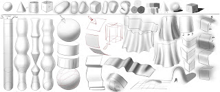
Anyway, I put together a sheet for all of you that I think will help immensely.
Last week we discussed basics about dimension and form. I gave you some simple tips and tricks to think about when composing your characters in a 3D space.
You all have great drawing talent, but rendering objects and lighting them effectively and consistently
is something you all need work on. I noticed you all don't have a solid idea about how to describe form which of course is hindering your ability to make your characters look like they live in a convincing 3 dimensional setting.
Your homework for the weekend is to use the information ive drawn, and re-draw ONE character
In 3 different views. Front, profile and rear. Your going to do a turnaround of your favorite (or least favorite lol)
First pose will face the viewer, second will face the left, 3rd will be a back view.
Using simple forms.
Hair should be decribed as a flat surface as well as clothing.But Play with drapery and subtly of shading and bending planes (drapery) as you go. ** but keep it broken down to simple shapes!!**
The feet shall not be flat to the viewer, the feet should be below eye level.
The eyes are eye level to the viewer and the waist between those two ranges.
Hands and feet should attempt to replicate the style of your character.
:if they're cylinders that come to a point (fingers) or the feet like a Triangular block of cheese?
Body shape as well. What is this shape your trying to describe most closely resemble.
Do your best but KEEP IT SIMPLE AND BROKEN DOWN!!
They should all be lit from left to right.
Lighting coming from the top off center left, not far far left.
Leave room for core shadows and a sliver of reflective light.
70/30 70%light 30%shadow.
All 3 poses should feel the same and be lit the same.
Separate your layers!! Separate your layers!!
Line drawing above, shading below. utilize a lasso but you don't have to, the line drawing will and should contain the form. Kept the lines on the left thin, while making the lines that are under or behind darker and heavier, giving the appearance of weight.
***USE 3 VALUES ONLY***. 10-20% grey, 30-40% mid grey 50-60% dark. WHITE IS HI-LIGHT, A white tshirt in the sun still isn't 100% white!! Only the planes facing DIRECTLY into the Suns direction will be purest white which is a very small percentage.
Nothing more then those 3 values and the white for light. Put these swatches of color on the drawing in the corner for us to see and you to maintain reference and continuity.
**no more then 2-3 strokes. If done right, there should only be one stroke.
Try and lay down the form shading in ONE PASS, no more then 3!!
LAY DOWN THE #2 value in ONE PASS
LAY DOWN THE 3rd value in ONE pass
Use the softest airbrush tip there is. No effects or weird stylized brush tools.
you will see what I used in the diagram. I painted well beyond the lines without erasing so you could see.
Set the opacity at 100% and put the value down in ONE PASS!!
If I see hairy, wild, uncontained brushy strokes all over the place the exercise will be repeated!!
**SHADOW FOLLOWS THE FORM**
**locate the surfaces FACING DIRECT LIGHT to figure out what will be the brightest, where the light will "fall off", and where it will turn a corner and recede into shadow.**
The line art can be pencil pen or digital, but the shading must be digital.
Use the brush style I'm using. Airbrush at HELLA soft!!
Adjust width accordingly to get the perfect core shadowing effect in ONE PASS!!
I'm going to bring a time lapse of the cloverfield illustrations I did where you can
see me applying this lesson to my own work and how simple it makes your life in knowing form!!
Please, have fun!!


